


Furniture Rental
Advantages of Modern Furniture Rental in Dallas
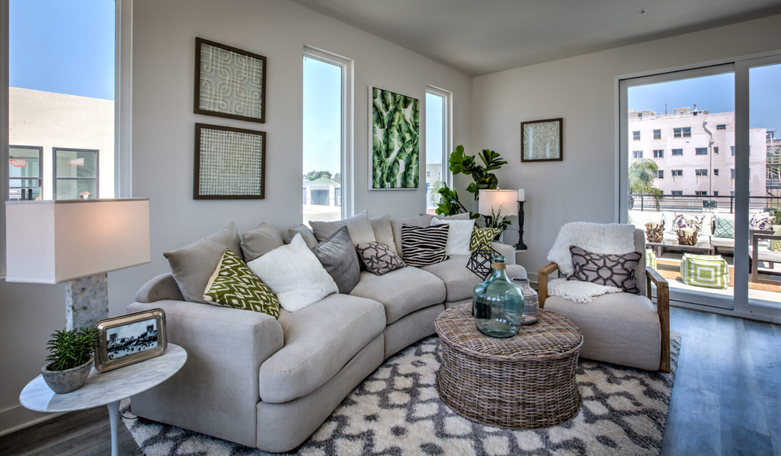
Dallas Texas has been growing steadily for the last decade. It has even become known as a tech hub for start up companies according to the Business Insider. While this city will always stay true to its cowboy roots, many residents are opting for a more modern feel in their homes and younger crowds are